
IMRC Website
A dynamic platform for research and debate, featuring diverse media formats such as video content, peer-reviewed articles, and podcasts centered on migration, mobility, displacement, and borders.

Reasons Users Come to the IMRC Website:
1
To learn more about the IMRC's mission, researchers, and/or projects
2
To find scholarly articles pertaining to migration
3
To listen to the IMRC's podcast or watch their videos
4
To get involved with the organization
Target Users & Behaviours
Our focus was supporting the informaton-seeking behaviours of students and scholars
To begin diagnosing the problems at hand, we conducted a content inventory of the entire site to get an understanding of the content itself, site organization, and navigation. After combing through the entire site, we narrowed down the problem to three glaring issues.
To gain a better context of the user behaviours of students, we conducted a review of several peer-reviewed research studies, finding that the main information-seeking behaviours used in this context were berry picking, foraging, and pearl growing. Thus, we knew that our changes to the website needed to fundamentally support these behaviours.
Information-seeking Behaviours We Need to Support:
Berry Picking
Where you do a query and get a long list of results
Then you click on a link, look around, and then come back to the results page
You essentially go "picking and tasting berries" at each result to find the best ones
Foraging
Instead of nibbling berries at random, users optimize the clues (scent of information) in order to get to the juiciest food fast
Hunting for the best food (results) by looking across the plains and picking up on the clues that tell you where the best food is
Pearl Growing
When you find one result and it’s good but its not enough - you need more like it
"I found this, how do I get more like it?"
Just like how pearls grow by having more and more layers added
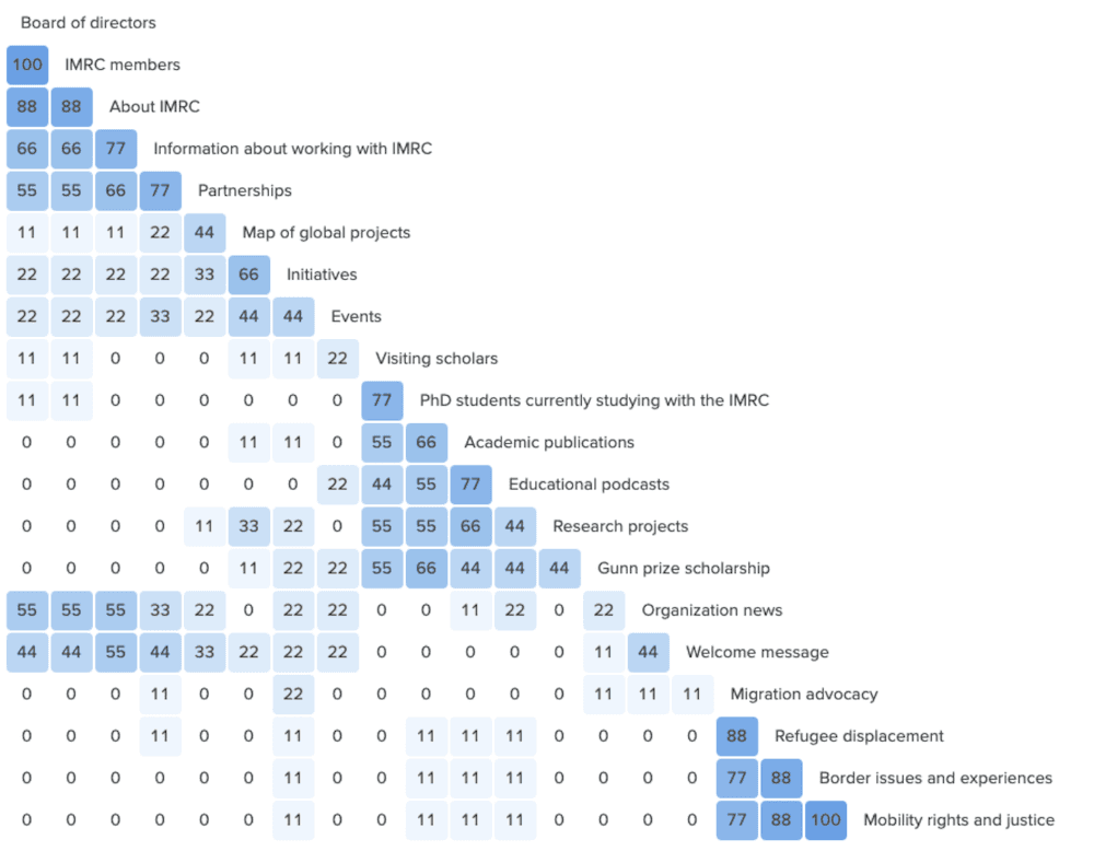
The Problem
Content was not organized effectively, labeling was inconsistent, and navigation was unclear
1
The site was not organized effectively
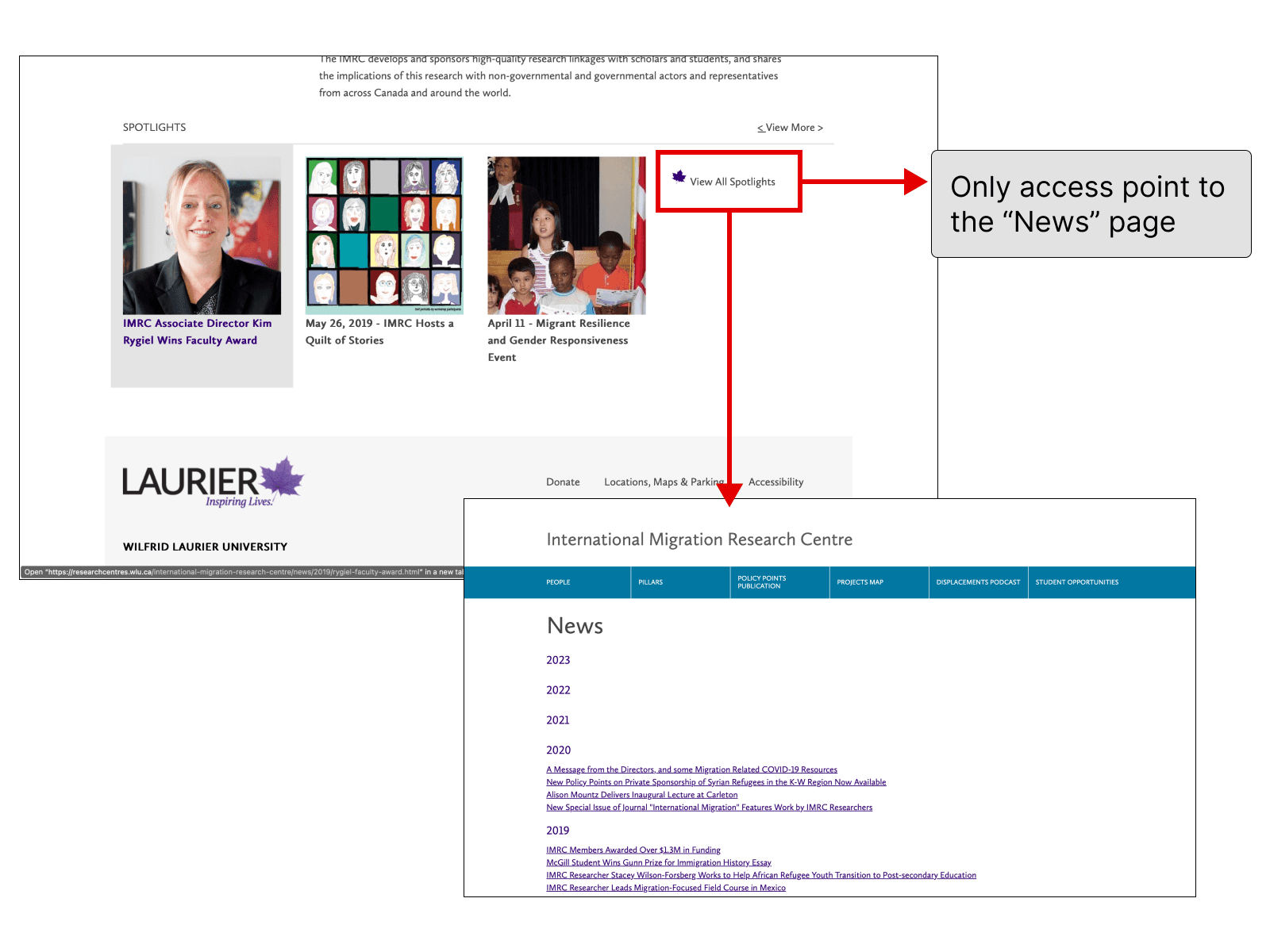
Some sections of the site felt hidden while other sections were outdated. For example, the News section of the site was unnecessarily difficult to navigate to, being hidden at the end of the spotlights section, while outdated sections of the website had entire top-level categories.
2
Labelling was inconsistent, not descriptive, and ambiguous
The site often used various names for the same content, which can be misleading for users. An example was “News” and “Spotlights” being used interchangeably.
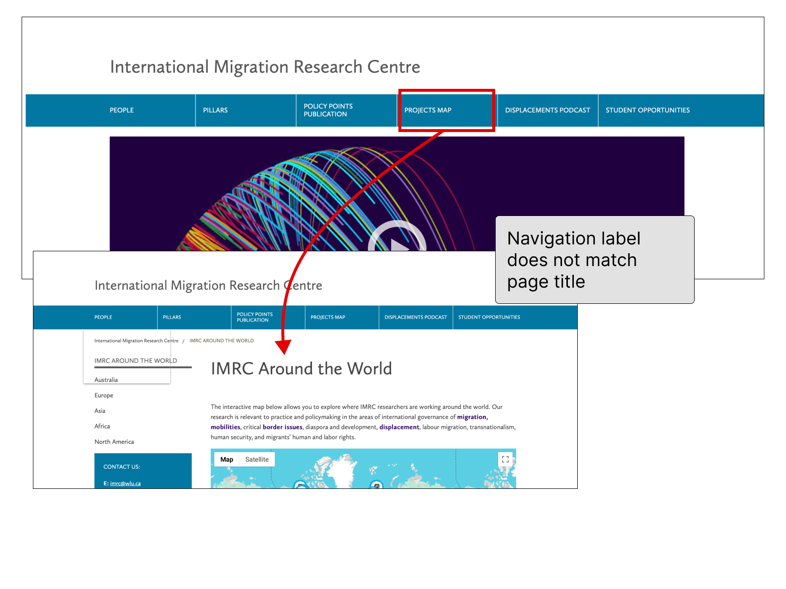
In other instances, labels did not match page titles. For example, clicking on “Projects Map” brought users to a page titled “IMRC Around the World”. While it may not seem like a large issue, inconsistent labels like these can make it difficult for users to find their way through the site. They might even question if they were brought to the right page.
There was also the issue of ambiguity for some labels. The label “Student Opportunities” sounded like a way for students to get involved; however, the content under it was actually about a scholarship award.
3
Navigation was unclear
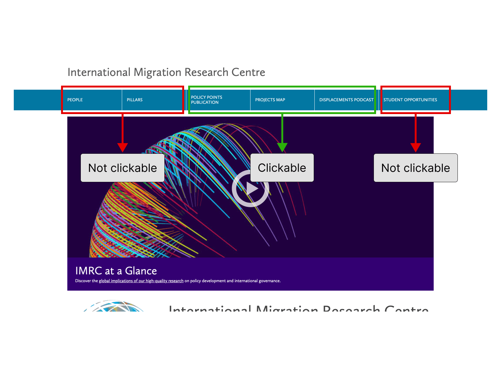
Some of the site’s top-level categories had their own page and were thus clickable while others did not. This made the site’s navigation unclear.
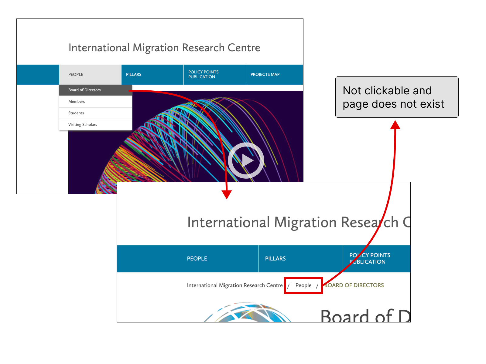
Another problem was that breadcrumb trails were misleading, showing that users had clicked through more pages than they actually had.
We learned that users primarily grouped content into 3 clusters:
Content about the IMRC itself
The members involved, partnerships, more about the organization
Content about the IMRC's research areas/focuses
Migration, refuge, borders, mobility
Content about the IMRC's research endeavours
Articles, projects, podcasts
Building on this mental model and labels users created, we proposed new top-level navigation labels
New Top-Level Navigation Labels
About
Content about the IMRC and its members
Our Focus
Content about the IMRC's research areas
Research
IMRC research content - articles, projects, podcasts
Events
Upcoming and past IMRC events
Get Involved
Opportunities to get involved with IMRC
Contact Us
Contact information for the IMRC
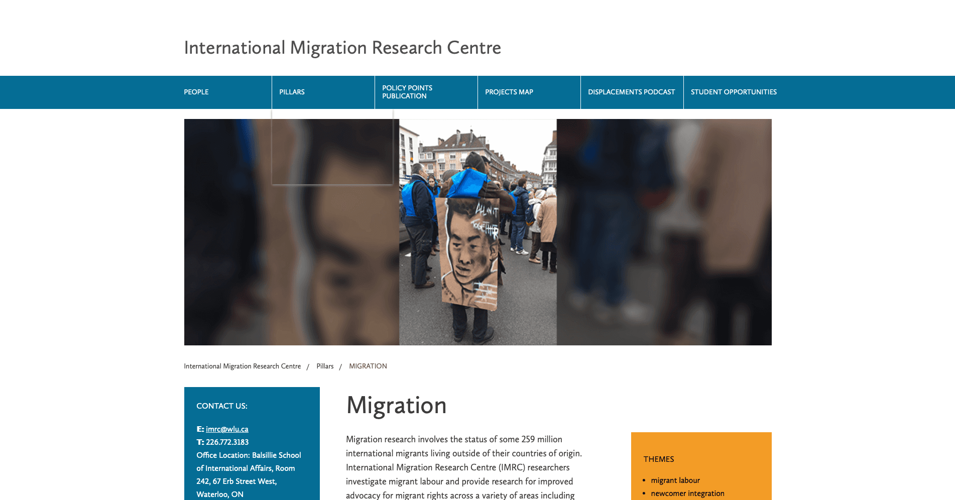
Old Top-Level Navigation Labels
People
Pillars
Policy Points Publication
Projects Map
Displacements Podcast
Student Opportunities
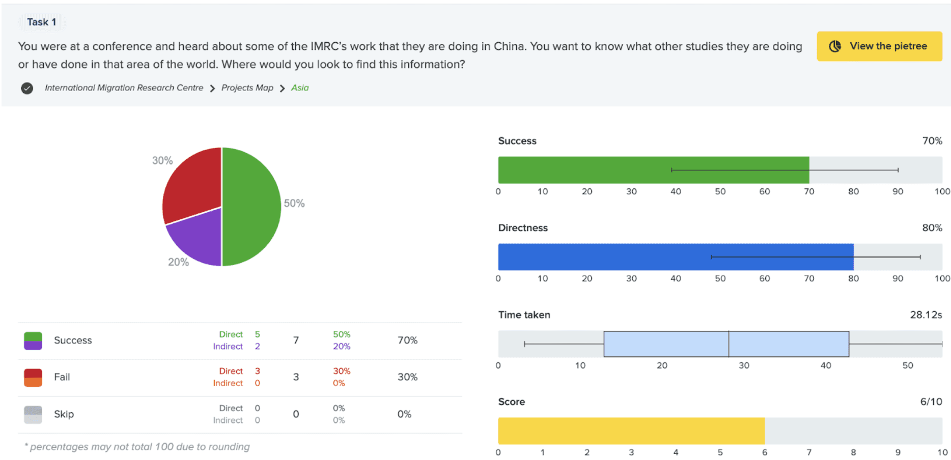
Task 1
You were at a conference and heard about some of the IMRC’s work that they are doing in China. You want to know what other studies they are doing or have done in that area of the world. Where would you look to find this information?
Using the existing website navigation structure:
Using our newly proposed website navigation structure:
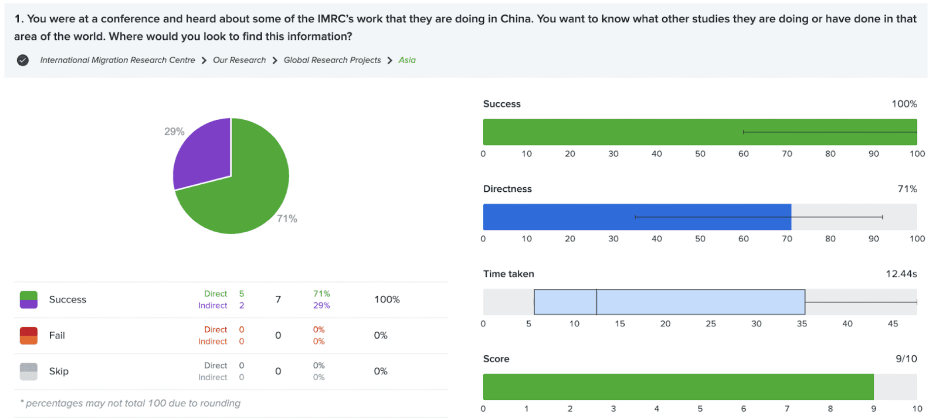
Key Results:
Task 1 Success increased from 70% to 100% using our proposed navigational structure
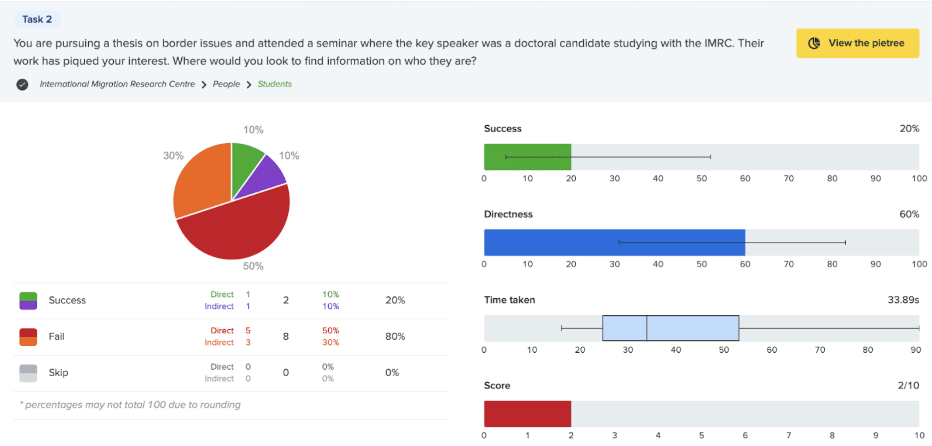
Task 2
You are pursuing a thesis on border issues and attended a seminar where the key speaker was a doctoral candidate studying with the IMRC. Their work has piqued your interest. Where would you look to find information on who they are?
Using the existing website navigation structure:
Using our newly proposed website navigation structure:
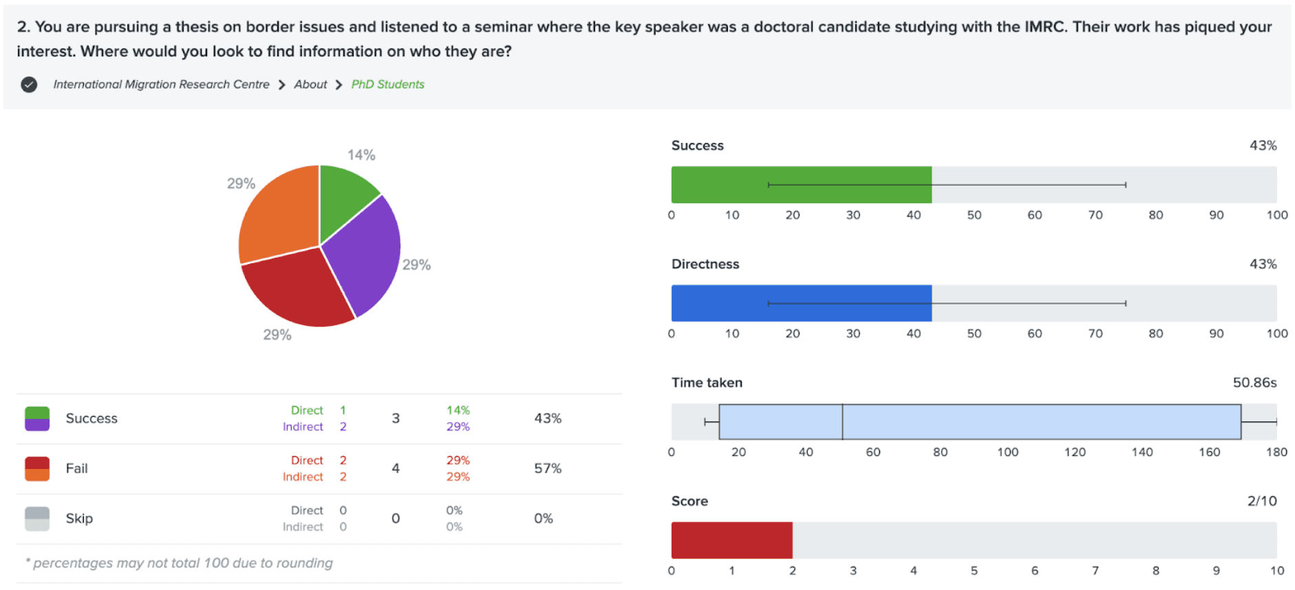
Key Results:
Task 2 Success only increased from 20% to 43% using our proposed navigational structure
Our Hunch
From analyzing what labels users pressed on, we had a hunch that because we mentioned "seminar" in the task wording, participants looked for information about a seminar rather than the doctoral candidate.
To test this hunch, we tested Task 2 again with a revised task wording that did not mention a seminar.
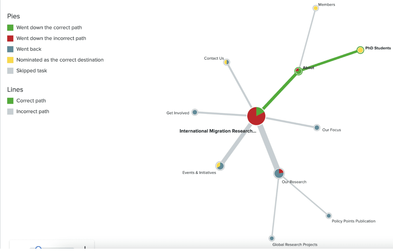
Task 2 - "seminar" mentioned in task wording
You are pursuing a thesis on border issues and attended a seminar where the key speaker was a doctoral candidate studying with the IMRC. Their work has piqued your interest. Where would you look to find information on who they are?
Pie Tree of Results using our Proposed Navigation (43% Success):
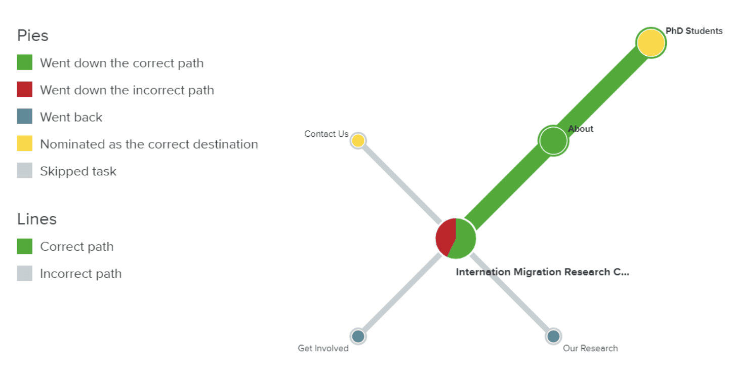
Task 2 - No mention of "seminar" in task wording
While working on your thesis, you were told about a doctoral candidate studying with the IMRC. You want to find out more about what this person does, but you have forgotten their name. Where would you look to find information on who they are?
Pie Tree of Results using our Proposed Navigation (80% Success):
Key Results:
Our hunch appeared to be correct. Testing this task without the mention of a "seminar" in task wording increased Task 2 Success from 20% using the existing navigation to 80% using our new navigation.
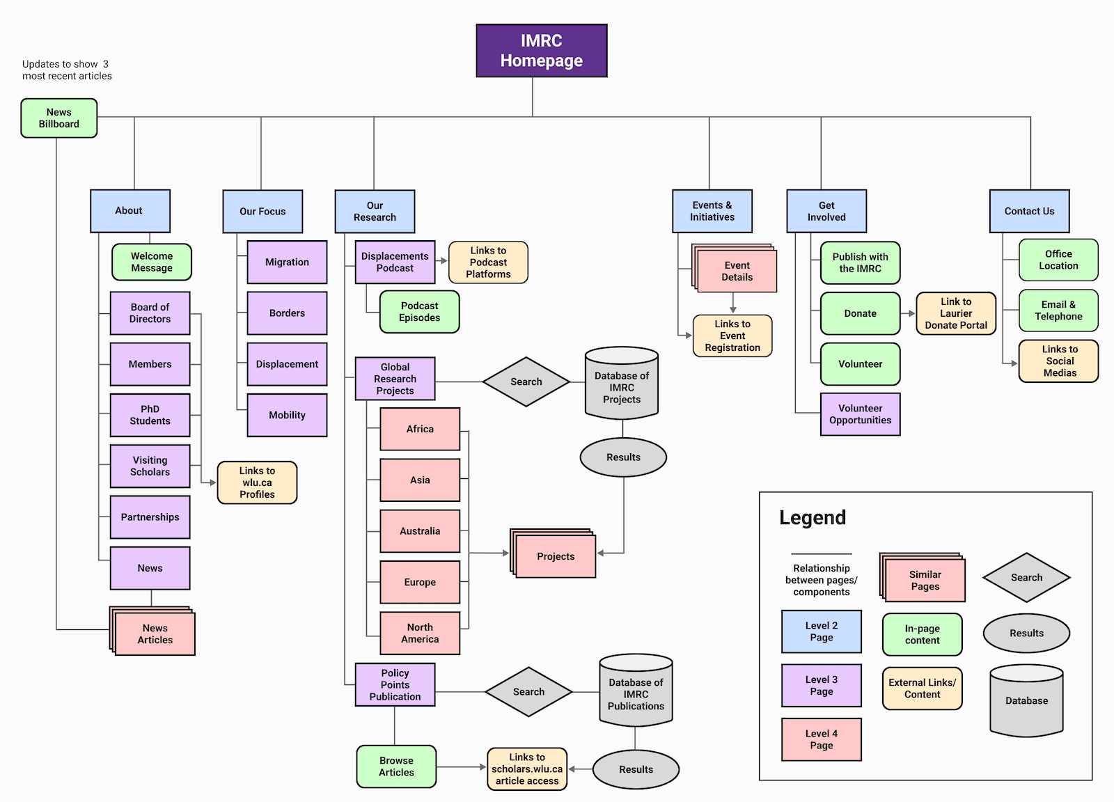
IMRC's New Info Architecture
A complete navigational restructure and content reorganization that improves navigability, matches user mental models, and maximizes information scent
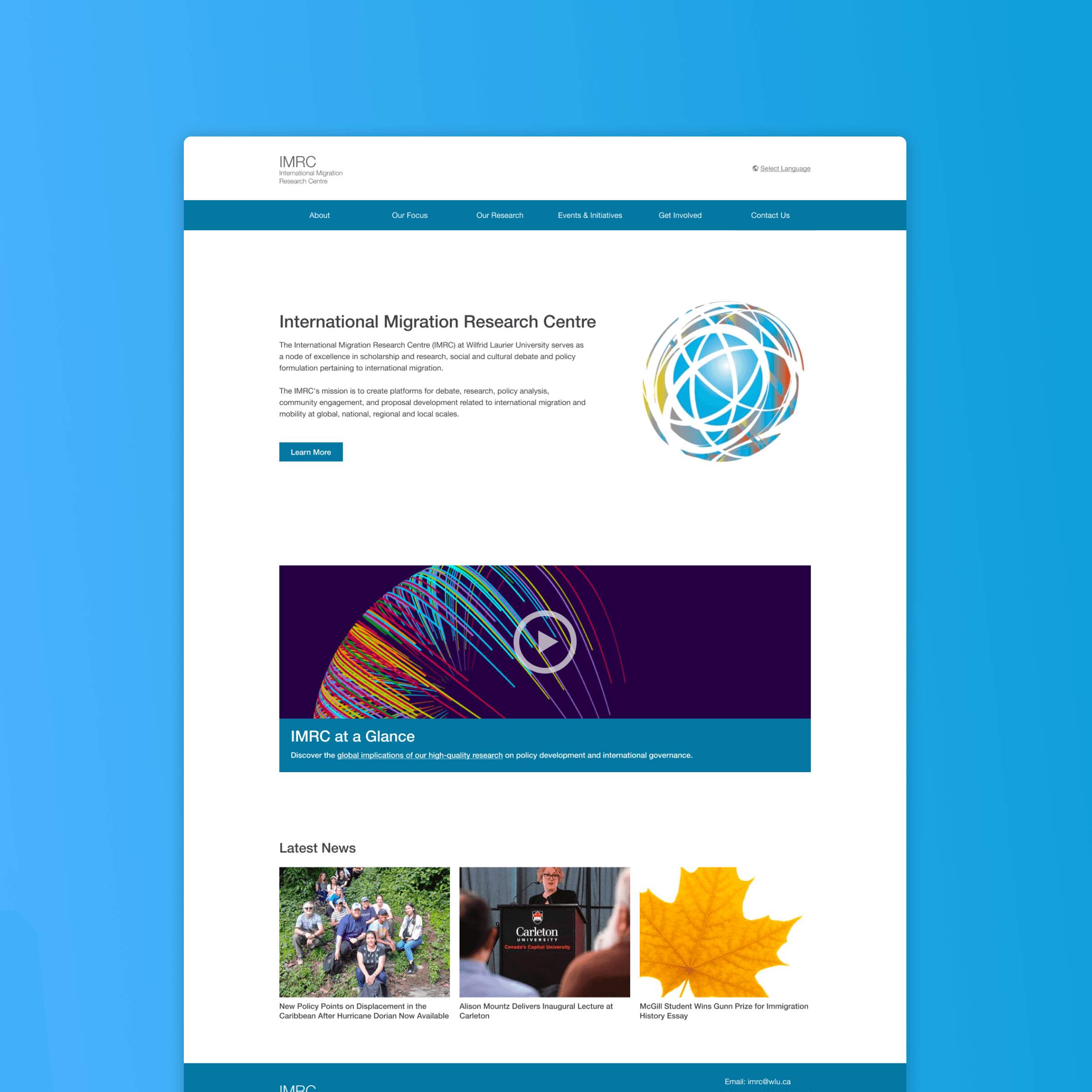
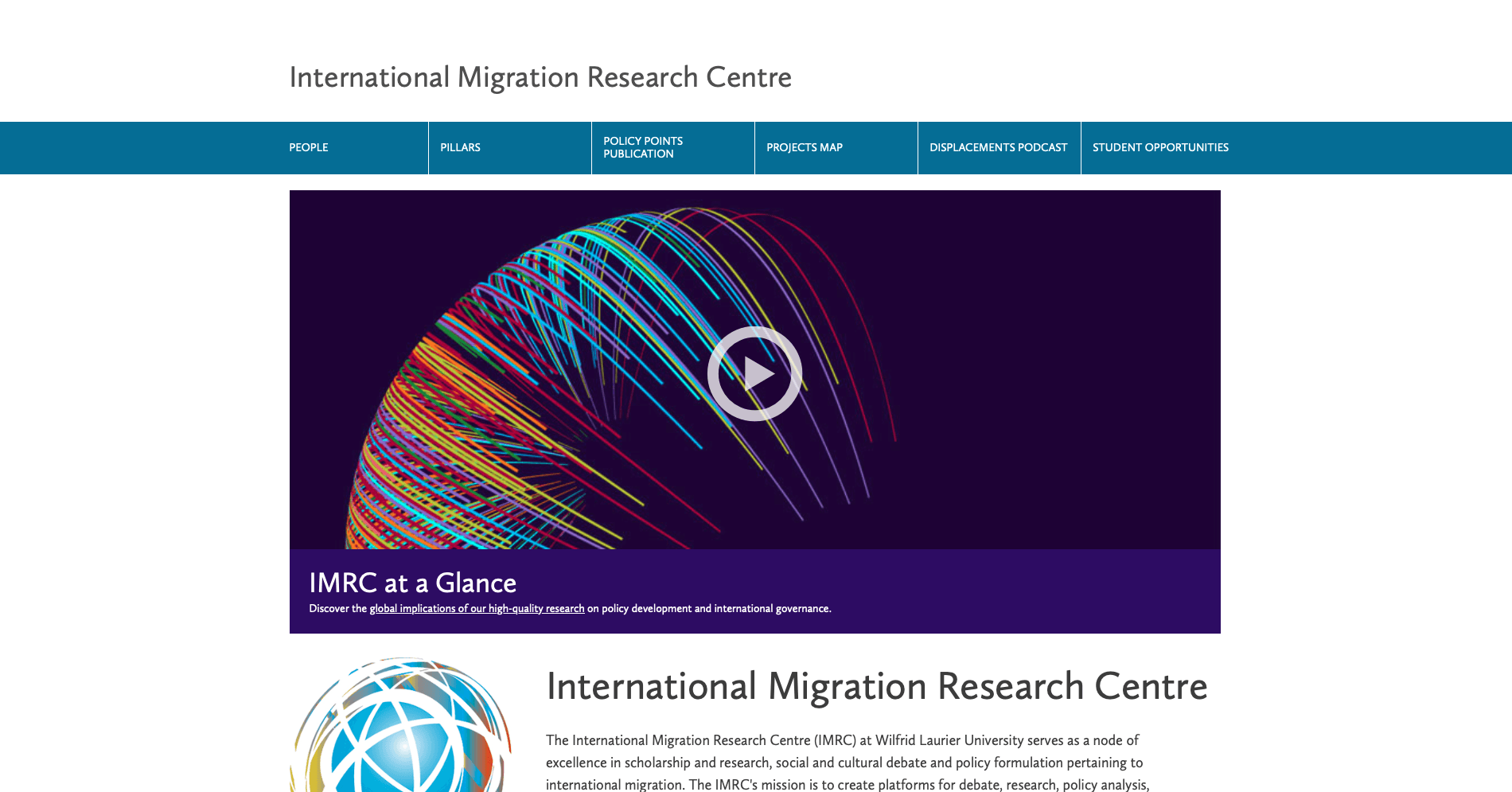
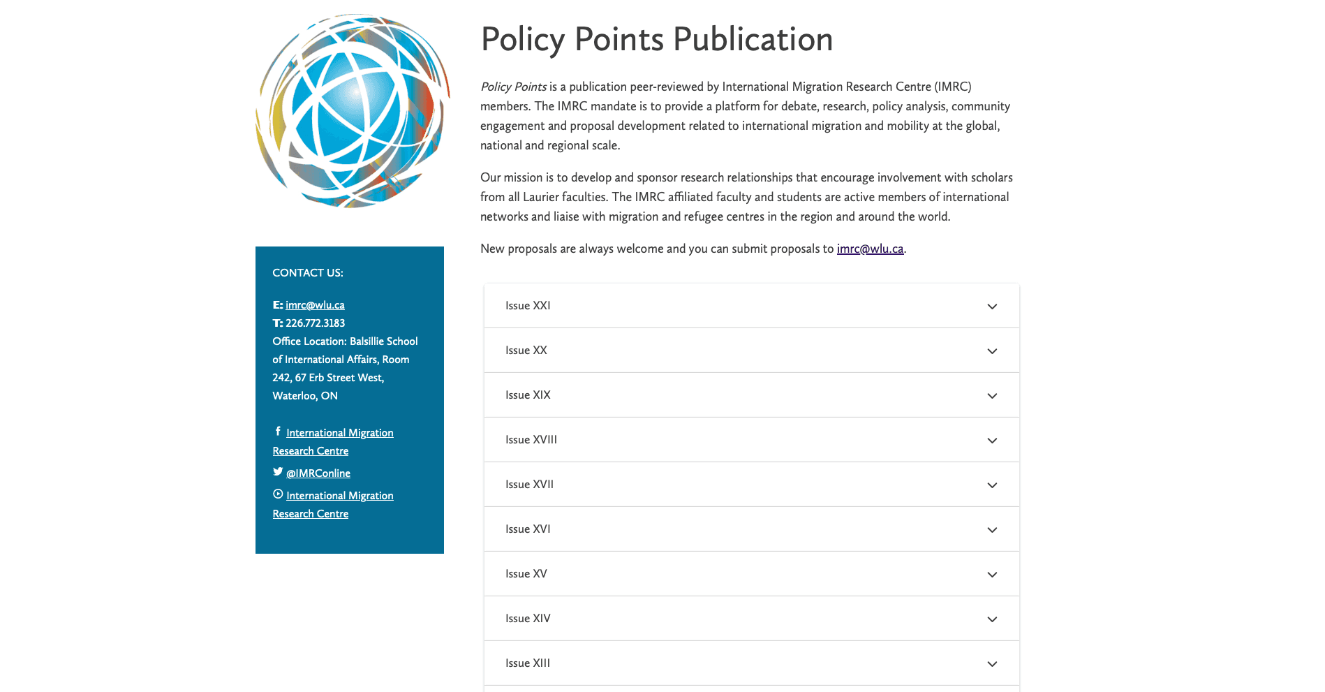
Before:
After:
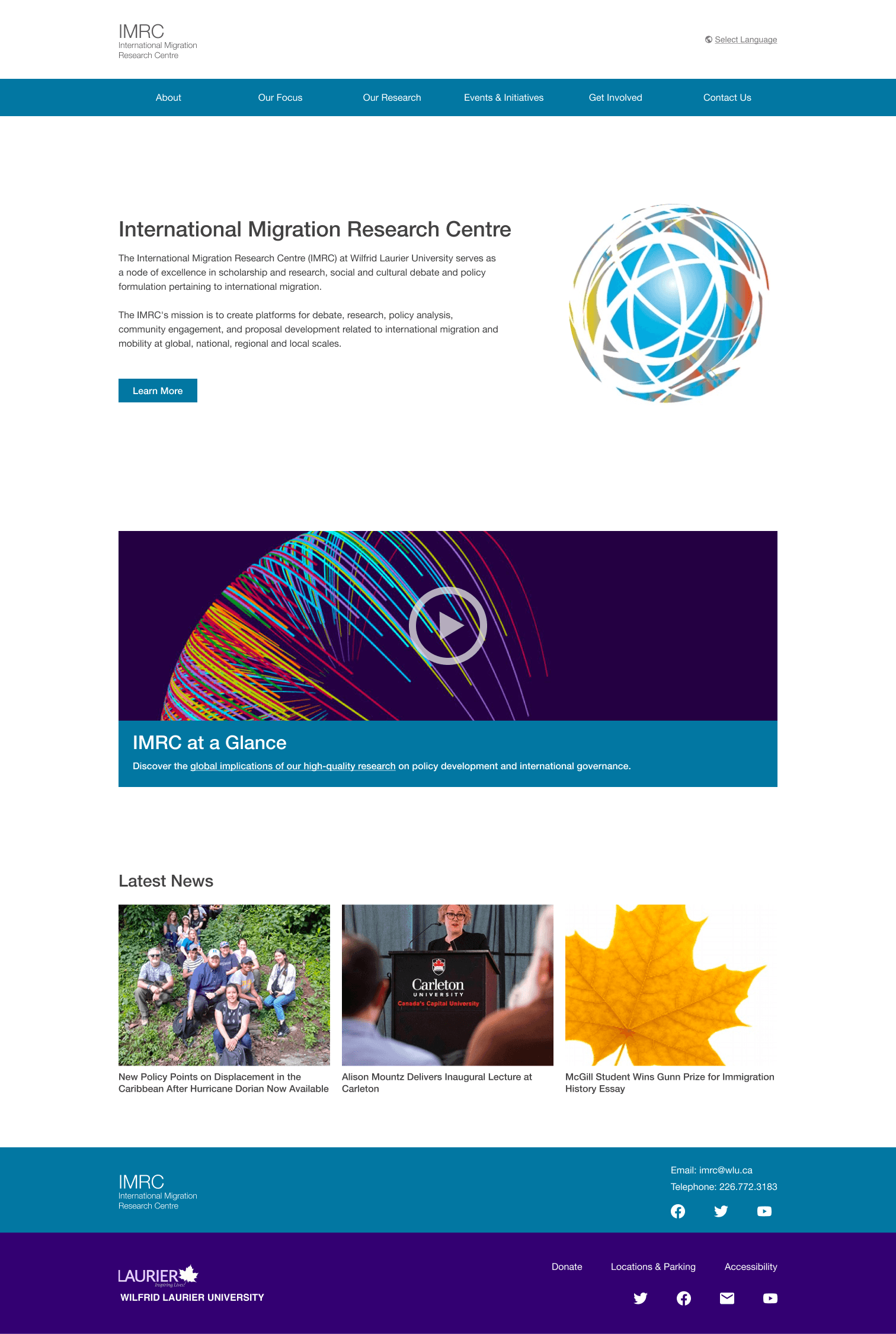
The site's new top-level categories in the navigation bar better match how user's expect information to be organized. This supports the site's navigability and helps users find what they're looking for faster.
Moving key information to the top of the page reduces "Iceberg Syndrome" where users can't tell what a site offers or is about upon immediate landing. In turn, this supports information forging and berry-picking by maximizing the information "clues" visible on the homepage
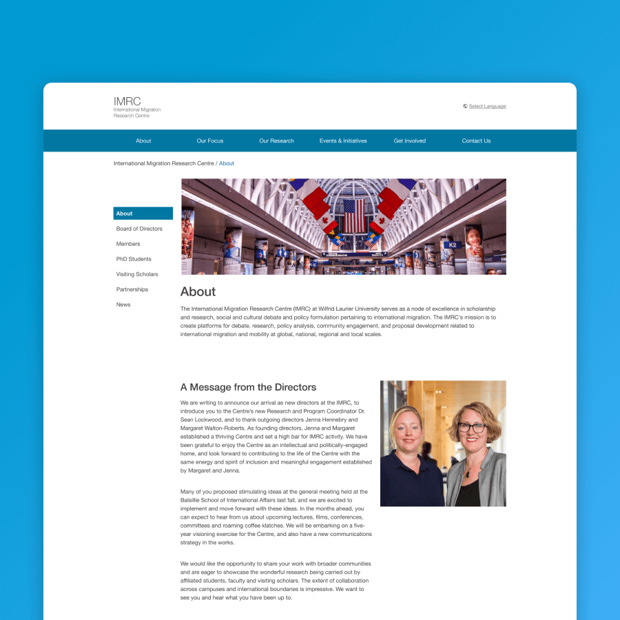
The incorporation of local navigation menus to support way-finding and user orientation
Before:
After:
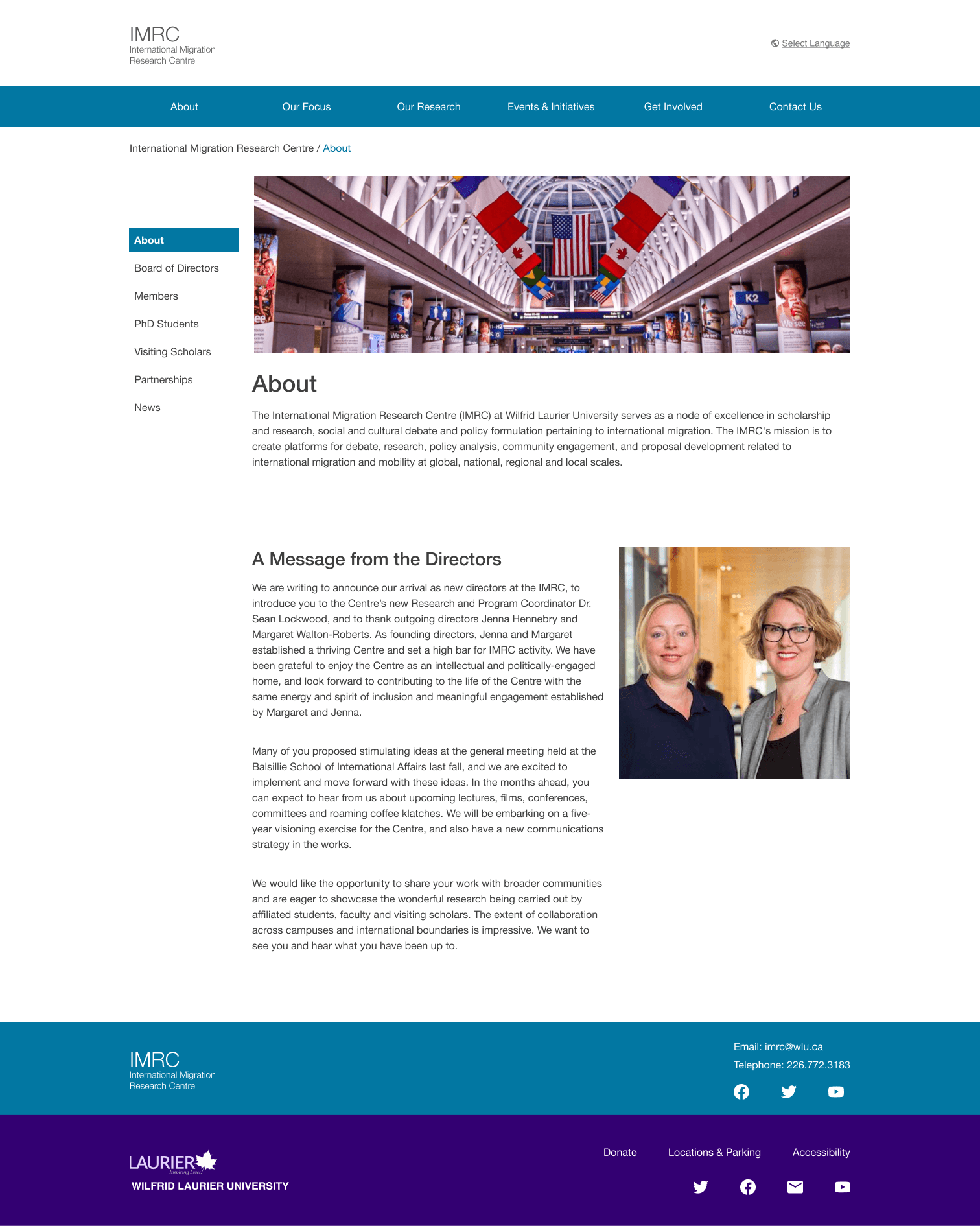
Local navigation menus help users orient themselves in certain sections of the site while also telling them what other content is contained in this section. In turn, this supports information foraging and berry-picking by providing information scent about the content offered on the site.
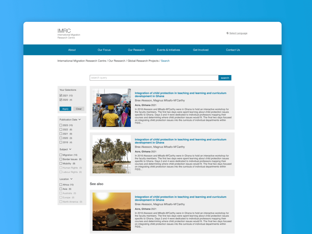
The addition of facetted search to make finding IMRC articles and projects hassle-free
Before:
After:
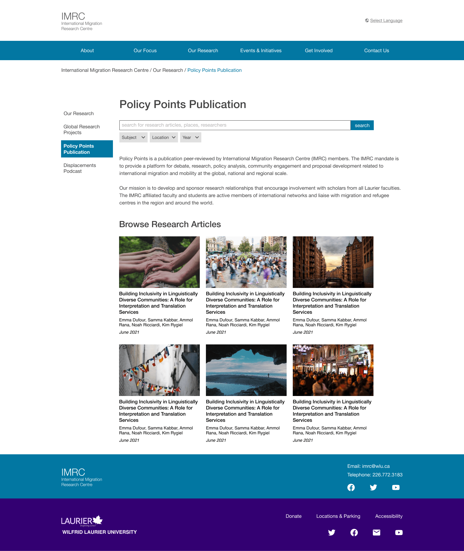
A search bar and search engine results page enables users to efficiently find articles matching their interests. Search facets also helps users narrow down results to the ones that best suit the user's interests.
This supports both pearl growing and information foraging as facets let users narrow down results according to their needs and results excerpts provide foragers with key information "clues".
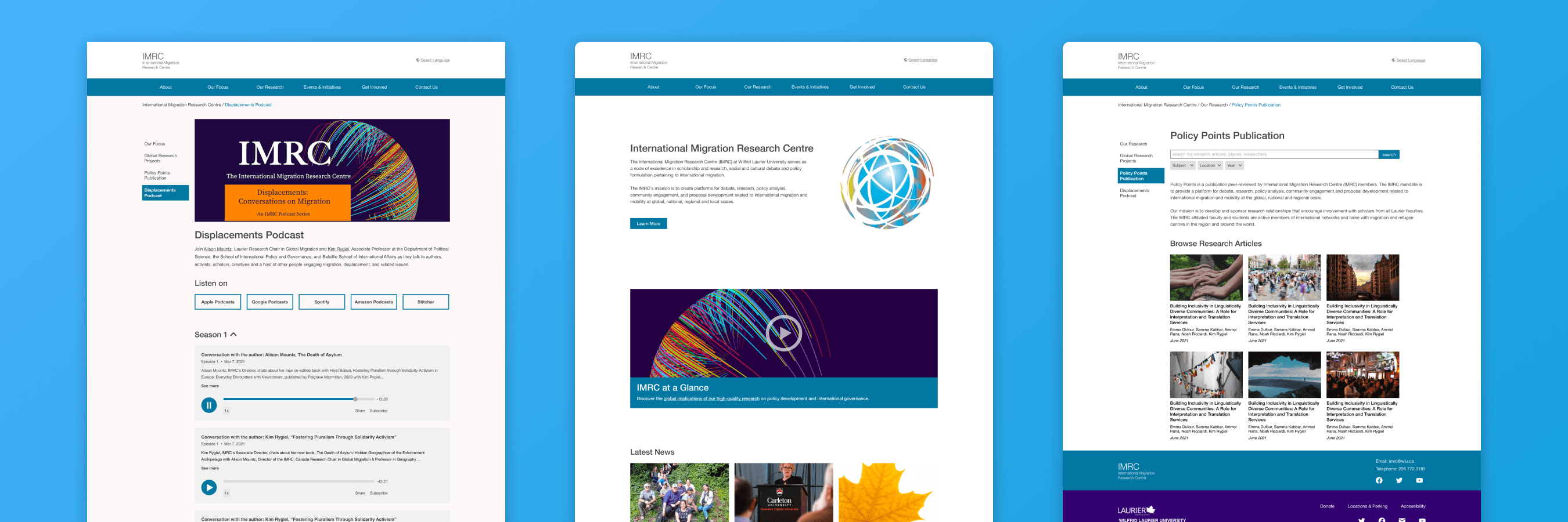
A podcast page that supports discoverability
Before:
After:
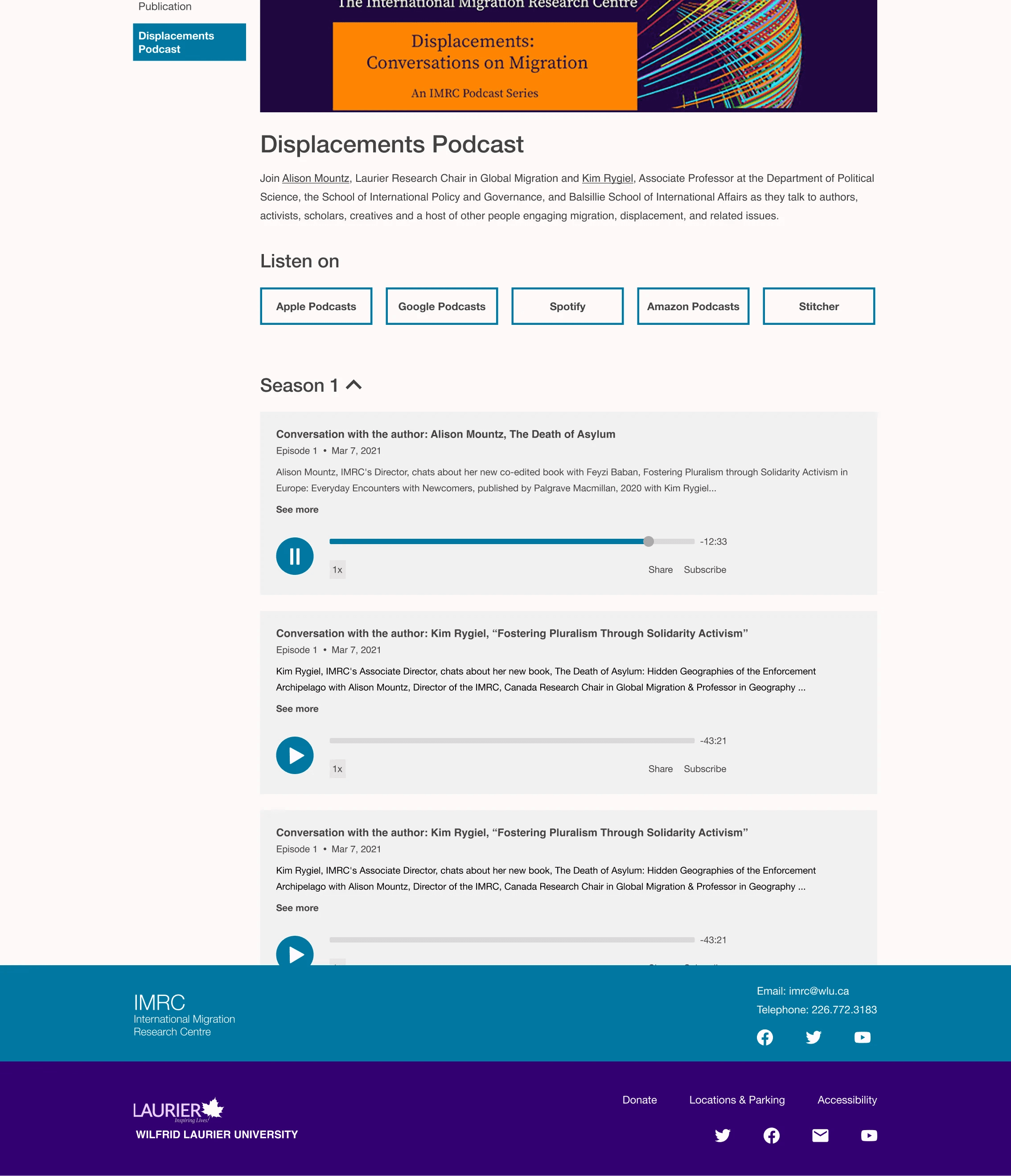
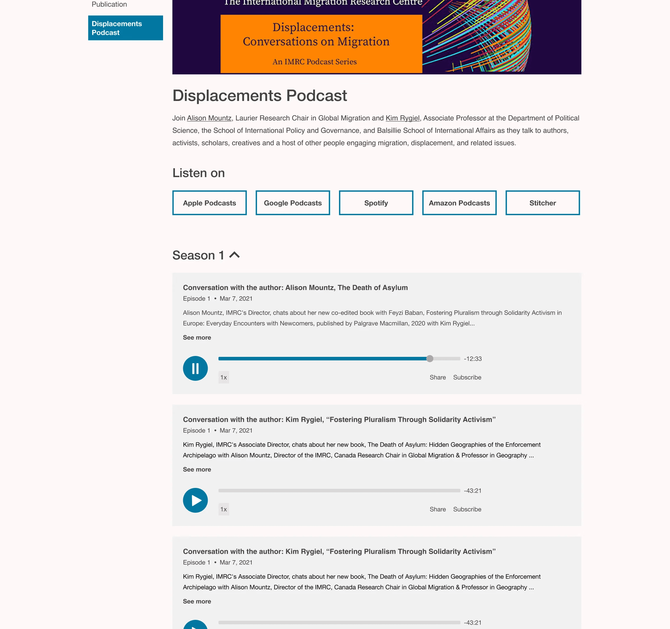
Having brief excerpts open about the podcast episodes provides more information scent to be picked up by pearl growing and berry-picking information seekers. Users can quickly determine whether an episode piques their interest or not.
Impact
Our redesigned navigational structure improved users' ability to complete tasks
Comparing tree testing usability testing results, there was an evident increase in users' ability to navigate and locate content using our newly proposed navigational structure.
45%
Increase in average task success
Learnings
Task wording and instructional design plays a much more critical role than you may think
During the tree testing phase, where we compared the navigability of the existing information architecture with our proposed structure, our second task ultimately failed due to poor task wording. We included too many topics in the scenario, which made it unclear what participants were actually being asked to find. This experience reinforced just how critical clear task wording and instructional language are to effective usability testing.
Test your hunches and assumptions
Although our second tree testing task was impacted by poor task wording, we would not have uncovered that insight without testing our assumptions. This experience reinforced the importance of using user feedback to confirm or challenge our hypotheses. In our case, had we not investigated whether the issue stemmed from the task wording, we likely would have revised the information architecture unnecessarily.